Oh hey, blog! Long time, no write! We’ve been so incredibly busy this past week with Valentine’s Day and my birthday that I haven’t had time to do anything but enjoy life and celebrate! I’m not complaining 😉 It’s been a great few days.
Now back to the blog world!
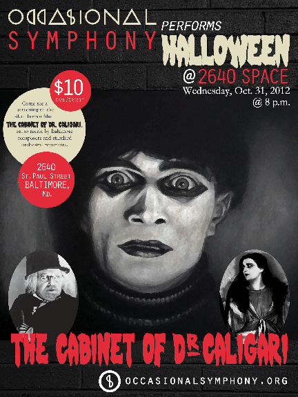
I had the pleasure of designing another poster for the Occasional Symphony this month for one of their upcoming events… remember the scary one I did last year?
Well this time around, the project was a little more… colorful! The Occasional Symphony is celebrating Dr. Seuss’ birthday at Port Discovery in Baltimore, Md. on March 2, so needless to say they didn’t want to scare all of the kids away with that creepy guy’s face again. Some polka dots, lots of fun colors and one topsy-turvy cake later, and their poster was complete!
This poster we a lot of fun to do. The background is a solid yellow with a 15 percent tint to it. Then, I took other tints of the same yellow and did polka dots across the back. The colors are all awesome and bright — definitely eye-catching for little kiddos. And the font is an imitation Dr. Seuss font that I found online for free! #Winning. Best of all is the three-layer, topsy-turvy cake, which I designed myself in Adobe Illustrator. It is just adorable. I love it!
If you live in or around Baltimore and need something to do March 2, you’re welcome. I basically just planned your Saturday afternoon for you. The program should be awesome.
I’ve been working on a few other design projects: a logo for my bff’s chocolate business, and a whole bunch of goodies for a local non-profit. It’s been a lot of fun. I love me some graphic design!


