Graphic Design

Maryland State L-O-V-E

I’ve been playing around in InDesign, trying to create a fun way to show my love of the State of Maryland. I’ve been at it for a while, but have been super disappointed in the designs I’ve come up with. I saw a fun DIY post from Design That Inspires that inspired me to create a fun “I heart Maryland” print either for our home or my office at work.

Here’s what they came up with to show their state love:

{View their DIY}

They painted their designs, but I’m not talented with painting at all. So, I turned my funky InDesign work-in-progress into my own version of their super cute State Love project.

I started out by snagging an outline of the state off of the interwebs. Originally, I tried filling the outline with the names of cities and counties in the state. I haven’t completely given up on this idea yet, but it’s stumping me for now.

The outline isn’t too pretty, so I used the Live Paint tool in Adobe Illustrator to change the stroke of the outline to look a bit smoother.

I popped this image into Photoshop and quickly filled the white areas with a pretty shade of blue using the Paint Can tool. Then I uploaded the .PSD file directly into InDesign.

Back in Illustrator, I created a ruby-red heart using the Pen tool. This is tricky, but I learned how to better use this tool in an Intro To Illustrator class I took recently.

I copied this heart into InDesign and dropped it right over Columbia! Added my favorite new font, Mossy, to the top… and Voila!

It’s too cute and not terribly difficult to do.

Plus, I really do love Maryland. Best state ever!

Graphic Design

Eye Chart designs

I am notoriously bad at remembering to go to the eye doctor. I never seem to remember to schedule an appointment until I’m down to my last pair of contacts. Whoops! Last time I went to the eye doctor I had to read off the eye chart. Normal, right? Well I managed to embarrass myself with this seemingly easy task. My eyes are really bad, so it was no surprise that I couldn’t see much past the giant “E.” But as I read each line with my left eye, then my right eye, I kept calling the “Z” a “2.” After the third time of calling out a number instead of a letter, my doctor asks, “You know there aren’t any numbers on the eye chart, right?”

Needless to say, I felt like a total dummy.

Onto my most recent design project. I’ve seen a few posters here and there with messages in the shape and style of the classic eye chart. They are pretty fun, so I created a few myself.

The key to this project is font size and the kerning between each letter. There needs to be a visible shift in font size in each line as you go down the page. In addition, you’ll likely have to play with the kerning (spacing between two individual letters) to get the lines to look just right.

Here is one I designed to go with the Love Prints I showed you all a while back:

For this design, my font started at 150 pt, then dropped to 100, 75,  50, and 23. Yes, 23. That’s what looked best to me for some reason.

This one I designed using a new font I just installed on my computer called Mossy. You can download the font for free (and a ton of other fun fonts) from http://www.dafont.com.

I MUSTACHE YOU A QUESTION

Bahaha. That cracks me up.

These fun eye charts take about 10 minutes once you figure out the font you like and what you want to say!

Graphic Design, Life

Sentimental Lyric Art

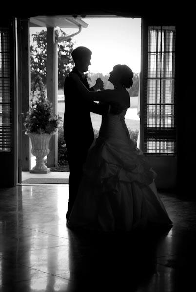
I showed you guys some lyric art I designed a few months ago and have wanted to do something similar with the lyrics from mine and Brian’s wedding song. We did a choreographed dance to Train’s Marry Me — nothing tacky, just a planned out ballroom dance with a few twirls here and there.

I was so proud of us when it came to our first dance. We took lessons at Stars Studio for all three of our dances: our first dance, the father-daughter dance and the mother-son dance. My neighbor Jolene owns the studio and her daughter Hannah is an amazing dancer and instructor. Hannah was awesome and choreographed a dance for us (pretty much on the spot while she was teaching it to us!). We had to practice so much, and the hubby was a bit nervous (I should add that doing a choreographed dance was his idea! I was totally shocked that he’d want to do something like that). Hannah also taught our parents and us how to do simple box steps so we didn’t look silly just swaying back and forth.

At our wedding the music for our first dance started a little early, so we were thrown off a bit at the beginning. After we got ourselves back on track we rocked it and were totally adorbs.

Mushy, mushy, mushy… I know :p

Anywho, I want to hang the lyrics to Marry Me in our new house with a few photos from our first dance. I’m thinking of matting it in a big silver frame. Totally cute? I think so!

Here’s my frist crack at making art out of the words.

I think it’s a fun reminder of our special dance that we worked so hard to perfect. I want to play around with the fonts a bit. I used Zapfino (the scrolly/swooshy font), Cambria and Chaparral Pro. The numbers at the bottom are Baskerville, which has really classy looking numbers (or so i think).

Here’s another version with a few different fonts. I wasn’t loving how much Cambria I used in the frist version, so I added in a few more fonts: Noteworthy, Spongy and Lesser Concerns.

Which version do you like better? I can’t decide!

Did you do something creative to remember your wedding song (or any other aspects of the wedding, for that matter)?