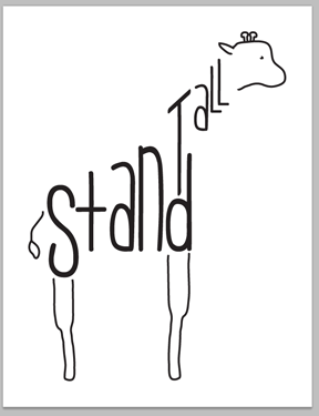
I love to play around with the Adobe Creative Suite because every time I do I learn something new. For this printable, I was inspired by a tattoo I saw on Pinterest. Here are screenshots of the project as I went along.
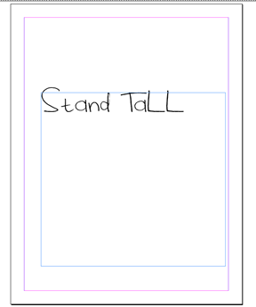
I like to start any project with words or a quote by simply adding my text to the page and fooling around with different fonts until I find one that is just right. You’ll probably notice two different fonts between these first few images and my final image — I exed out of my original design and lost everything I had done so far so I had to start for square one again. Whoops.
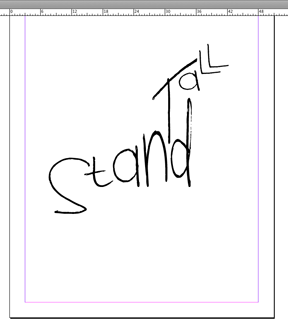
After the text is on the page, I start manipulating it, sometimes adding different parts of the words into different text boxes altogether. For example, the “s” in “stand” is in its own text box, while “tand” is in another. This allows you to maneuver your text exactly how you want it. Since I wanted the “S” lower and in a larger font, it was easier to create a new text box for it than to leave it with the rest of the word. In that same vein, each letter in “tall” has its own text box.
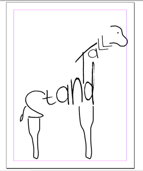
After I squeezed, stretched, angled, shrunk, etc. my letters, I started adding the rest of the picture. I used the pencil tool and the smoothing tool to add these lines.
Notice the switched fonts? It worked out for the best I think.
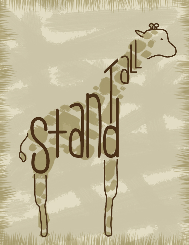
With the InDesign portion of my printable done, I grabbed the vector image I created and dropped it into Photoshop.
On many different layers, I tinted the background, added the paintbrush texture, added giraffe spots and added the grass border. I had to play around with the opacity of each layer, but once I messed around with it enough I think I got it just right.
What do you think of the final product?
