Graphic Design

Occasional Symphony performs HALLOWEEN

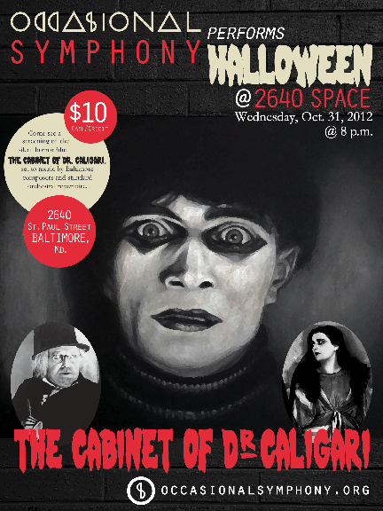
I’ve had the pleasure of working on a poster for my friend’s fiance’s symphony’s (say that three times fast) upcoming performance at the end of October.

Occasional Symphony is a new symphony in Baltimore whose goal is to celebrate holidays by playing concerts at unique venues all across Charm City. For their performance of Halloween (which is on, yes, Halloween), they rented an old church and will be  playing eerie music while showing the silent  horror film The Cabinet of Dr. Caligari. The creepy tunes were created by local composers — too cool!

I was so excited to help, especially on such a unique project! I was able to grab shots from the movie — the copyright has run out — and tweak them in Photoshop using the dry brush filter. I added a brick texture to the background and found a super creepy font to use. I think it looks fantastic, and Rachel, Norman and crew are really happy with it. Yay!

Here’s what I came up with:

If you live in or near Baltimore, make sure you check out an Occasional Symphony show! It sounds like they will be doing some really cool things.

Oh, and because I think it is super awesome, look at the shout out I got on their site *squeals of excitement*:

Graphic Design

The only BOSS I answer to…

Guess who gets to see Bruce Springsteen again in concert on September 14th!?!?!?!?!?! If you guessed me, you guessed right. I’m extra excited for this concert and I’m pretty much listening to Springsteen 24/7. SOOOOOO… with that being said, I made myself a new background for my computer/ a new print for my craft room so I can be extra extra pumped up! I took a few screen caps along the way to kind of show the process I took to create this awesome piece of art. I am in love.

First, I created a single text box in InDesign and typed my phrase, “The only boss I listen to is Springsteen.”

I pulled up my Mac Font Book and started scrolling through the fonts, choosing different ones I thought might look nice for this piece. I probably went through about 10 of so before picking the one I ended up with (not the one below).

Then, I highlighted the word “boss” and made it all caps using the TT/caps tool in InDesign.

I didn’t screen cap this next part (sorry!). I went to everystockphoto.com and search for Springsteen photos. I found one for free that I downloaded and opened in PhotoShop. I did a quick cutout, removing the other singers and background so only Springsteen, his guitar and his microphone stand are visible. I then applied a filter to the image so it looks a little like water color paint. I really liked the effect, so I saved my PSD file and imported it into InDesign.

I also changed the wording up a bit, swapping in “answer” for “listen” and adding “Bruce.” The original saying I’d seen before (I bought my Dad a T-shirt with it on it, actually!), so I tweaked it to make it my own version.

Once I got the Boss in there, I hated the font I originally chose, so I switched to the font I ended up with: The Maple Origins.

I then started breaking my text up, creating individual text boxes for almost each word to allow me to space them the way I wanted them to look. That also allowed me to change the font size of individual words instead of groups of words.

Once that was complete, it needed something else. I created a black background and turned the text white to accomplish this look (if you look closely you can see the text boxes and guides I used).

Once I was happy with all of the spacing, I exported my file to a JPEG, and tada! Isn’t it awesome!?

If you are not a Springsteen fan, you probably won’t care much about this. But hopefully you can use some of the steps to create your own works of art using InDesign. There’s so much you can do!

What do you think? Awesome, right?

Gotta love the Boss 🙂

Graphic Design

“If you’re a bird, I’m a bird” print

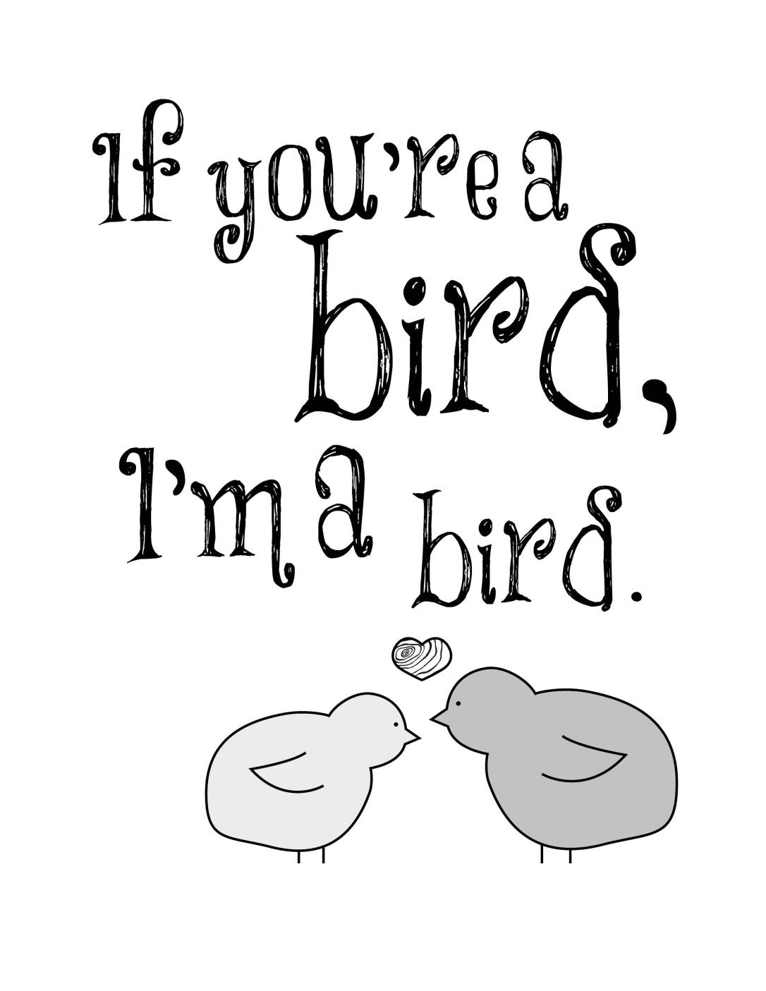
One of my favorite movie quotes is from The Notebook: “If you’re a bird, I’m a bird.”

I think it’s just charming. And yes, I know I love it because it has to do with birds and I love birds. It’s a problem. So many bird things in my house haha. I might need therapy.

Anyway, in an effort to keep up with the skills I’m learning in my classes, I created a print of my favorite movie quote using Adobe Illustrator, Photoshop and InDesign.

To start with, I found a font I wanted to use from a bunch of fonts I just downloaded for free. I chose a font called “Things we said” thinking it resembled the rings in a tree.


After I chose my font, I got to designing little birds for my print. I did this in Illustrator using basic shapes and combining them to create one outline. I added an eye and a wing, and my little birdie was born. Super cute.

Using a heart from a previous project, I popped two birds and a heart into my InDesign file. I tinted the birds two different shades of gray and left the heart white. After a while I decided it was missing something, so I snagged a photo of tree rings off the interwebs and pulled it into Photoshop. There I made the photo black and white and cropped out the excess of the photo. I then imported into the inside of my heart.

Here’s my finished design. What do you think?

I framed it in black to pull from the only color in the design and hung it in our new bathroom. Gah. So cute 🙂 You can see its home in my house as soooooon as I find a dang mirror for my bathroom. Soon!

Update:

Our bathroom is finished!!! HOORAY! Post coming tomorrow 🙂 For now, here’s a sneak peak at the color and adorable artwork: